Whimsical is for visual thinking
A recent discovery, Whimsical has quickly (within days) become my new favorite tool for thinking differently.
While my digital ecosystem is quite robust and maybe not in need of another app—though A knowledge worker’s toolkit needs to be well-rounded—this one is really special because it’s delightful to use and helps me think in ways that other digital apps do not.
Whimsical facilitates visual thinking in an intuitive and magical experience. The visual-first focus is what makes it a unique addition to my existing stack of apps. It also handles docs, which I haven’t fully explored yet, but they look incredibly promising and I can see certain use cases for them over time.
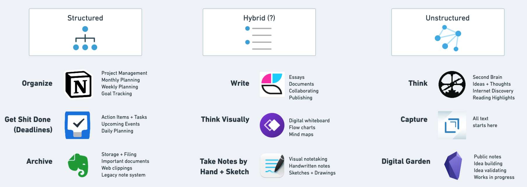
Whimsical is what I used to visualize this diagram of my ecosystem:

I found myself struggling to reduce the number of apps I use in my workflow. So what happened? I added another one, naturally!
Honestly, I had Whimsical on my mind because of a recent conversation, and I’ve been using Miro on a client project and it’s been good (but not great) so visual thinking has been hanging out in the back of my mind. When realizing how much time I was spending trying to write/outline my way through to better understanding of my system, I thought “why not draw it out?” and see what happens.
Enter Whimsical.
Very quickly I had diagrams up and running and keyboard shortcuts committed to memory. The ability to go from “never having used this before” to “I feel like a pro” took only an hour or two, and I’ve only grown my comfort with the tool.
After many (many) iterations of the diagram above, all done in Whimsical, I was able to leave my design session feeling good about the progress I made, which has since then (~12 hours later) shifted the way I think about the apps and services I rely on to do my work.
No tool is perfect, and too many tools can have negative consequences, but so far I’m really happy with my digital ecosystem, including the addition of Whimsical